The perception of light and color.
author: Sincerelux
2024-09-20
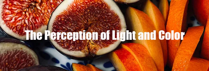
In lighting design, the perception of light and color is a crucial field since it directly impacts how we understand and feel the space. Here are some key concepts and details about light and color perception:
Light Perception:
Luminance: Luminance is how we perceive the intensity of light, and it is affected by the intensity of light and the sensitivity of our eyes.
Contrast: Contrast refers to the differences in brightness between different areas in the field of view, which affects our recognition of objects and shapes.
Glare: Glare results from excessively high luminance or contrast and leads to visual discomfort. Good lighting design should aim to minimize glare.
Visual Comfort: Lighting design should consider visual comfort, ensuring an even distribution of light and avoiding overly harsh or uneven lighting effects.
Color Perception:
Color Temperature: Color temperature describes the color of light emitted by the light source and is usually measured in Kelvin (K). Lower color temperatures (such as 2700K) produce warm light, while higher color temperatures (such as 6500K) produce cooler, whiter light.
Color Rendering Index (CRI): CRI measures a light source's ability to accurately reproduce the colors of objects. Lights with a higher CRI can represent object colors more realistically.
Color Saturation: Color saturation refers to the purity or intensity of color. In lighting design, choosing an appropriate light source can enhance or diminish color saturation to meet specific design needs.
Color Use in Lighting Design:
Creating Ambiance: Colors can be used to create a particular ambiance. For example, warm tones can create a comfortable and relaxing environment, while cool tones can produce a fresh and efficient feeling.
Visual Focus: By using color contrasts and lighting emphasis, specific objects or areas can be highlighted as visual focus points.
Brand Recognition: Commercial lighting designs often use specific colors to enhance brand recognition.
Interaction between Light and Color in Lighting Design:
Reflection and Transmission: Lighting design must consider light reflection and transmission in space, which affects color perception and overall spatial feeling.
Effects of Materials and Surfaces: Different materials and surfaces have varying light and color reflection and absorption, which affects lighting effects.
Lighting Design Tools and Techniques:
Lighting Simulation Software: Using computer software to simulate lighting effects can aid designers in predicting and evaluating the perception of light and color in a particular space.
On-Site Lighting Testing: On-site lighting testing can provide practical observations and adjustments to the perception of light and color.
Understanding these concepts is crucial for creating lighting designs that both meet functional needs and have aesthetic value. Through well-designed lighting schemes, visual comfort and aesthetic experience in specific spaces can be enhanced.
Light Perception:
Luminance: Luminance is how we perceive the intensity of light, and it is affected by the intensity of light and the sensitivity of our eyes.
Contrast: Contrast refers to the differences in brightness between different areas in the field of view, which affects our recognition of objects and shapes.
Glare: Glare results from excessively high luminance or contrast and leads to visual discomfort. Good lighting design should aim to minimize glare.
Visual Comfort: Lighting design should consider visual comfort, ensuring an even distribution of light and avoiding overly harsh or uneven lighting effects.
Color Perception:
Color Temperature: Color temperature describes the color of light emitted by the light source and is usually measured in Kelvin (K). Lower color temperatures (such as 2700K) produce warm light, while higher color temperatures (such as 6500K) produce cooler, whiter light.
Color Rendering Index (CRI): CRI measures a light source's ability to accurately reproduce the colors of objects. Lights with a higher CRI can represent object colors more realistically.
Color Saturation: Color saturation refers to the purity or intensity of color. In lighting design, choosing an appropriate light source can enhance or diminish color saturation to meet specific design needs.
Color Use in Lighting Design:
Creating Ambiance: Colors can be used to create a particular ambiance. For example, warm tones can create a comfortable and relaxing environment, while cool tones can produce a fresh and efficient feeling.
Visual Focus: By using color contrasts and lighting emphasis, specific objects or areas can be highlighted as visual focus points.
Brand Recognition: Commercial lighting designs often use specific colors to enhance brand recognition.
Interaction between Light and Color in Lighting Design:
Reflection and Transmission: Lighting design must consider light reflection and transmission in space, which affects color perception and overall spatial feeling.
Effects of Materials and Surfaces: Different materials and surfaces have varying light and color reflection and absorption, which affects lighting effects.
Lighting Design Tools and Techniques:
Lighting Simulation Software: Using computer software to simulate lighting effects can aid designers in predicting and evaluating the perception of light and color in a particular space.
On-Site Lighting Testing: On-site lighting testing can provide practical observations and adjustments to the perception of light and color.
Understanding these concepts is crucial for creating lighting designs that both meet functional needs and have aesthetic value. Through well-designed lighting schemes, visual comfort and aesthetic experience in specific spaces can be enhanced.
CCT in Lighting Design
What's UGR?
Related Article
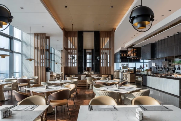
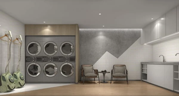
Enhance Hospitality Spaces with Hotel Accent Lighting, Flush Mount Downlights, and Trimless LED Downlights